


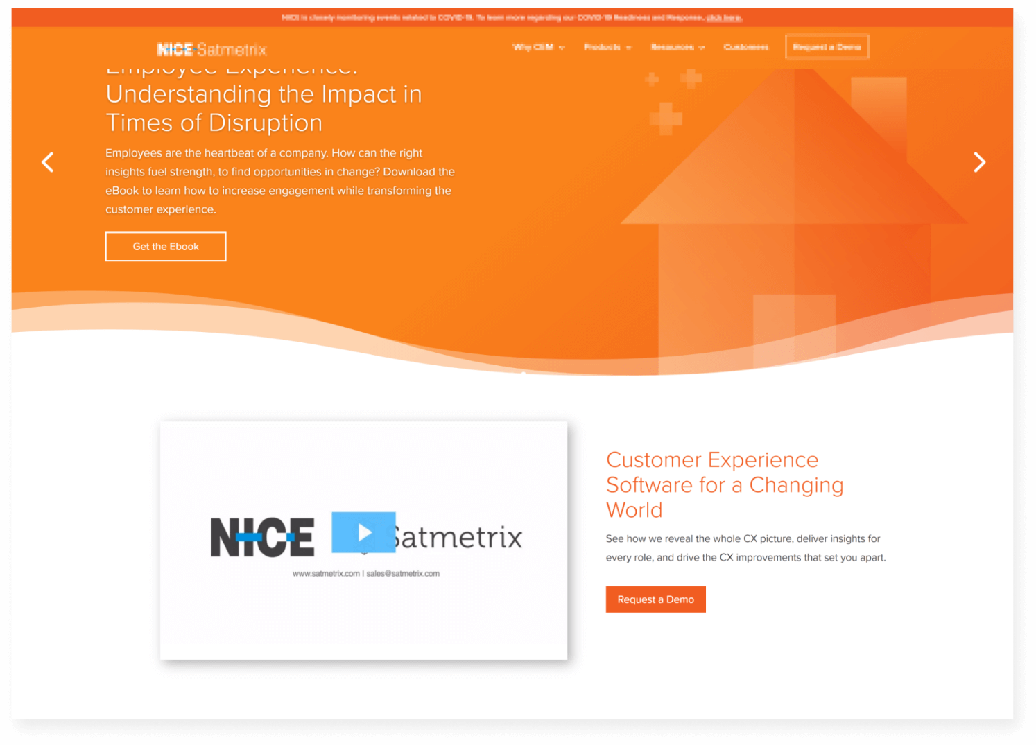
Satmetrix’s website lacked the rich introduction that could be achieved above the fold. While brand strong, the orange background felt monotonous and desolate. This inspired us to prioritize a compelling, high-impact opening section. We selectively adapted their clean transitions for a polished and breathable layout.
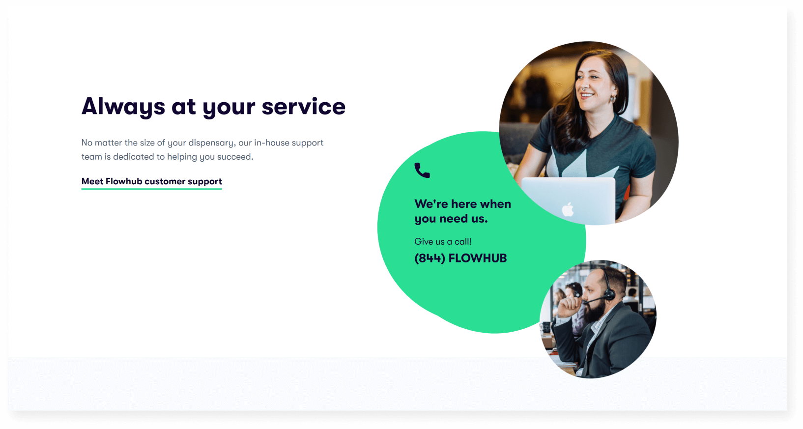
Flowhub’s focus on great customer service was reflected through their humanistic use of blob design, real people, and vibrant color choice. Demonstrating how these elements bring the warmth and personality accompanying a real product.
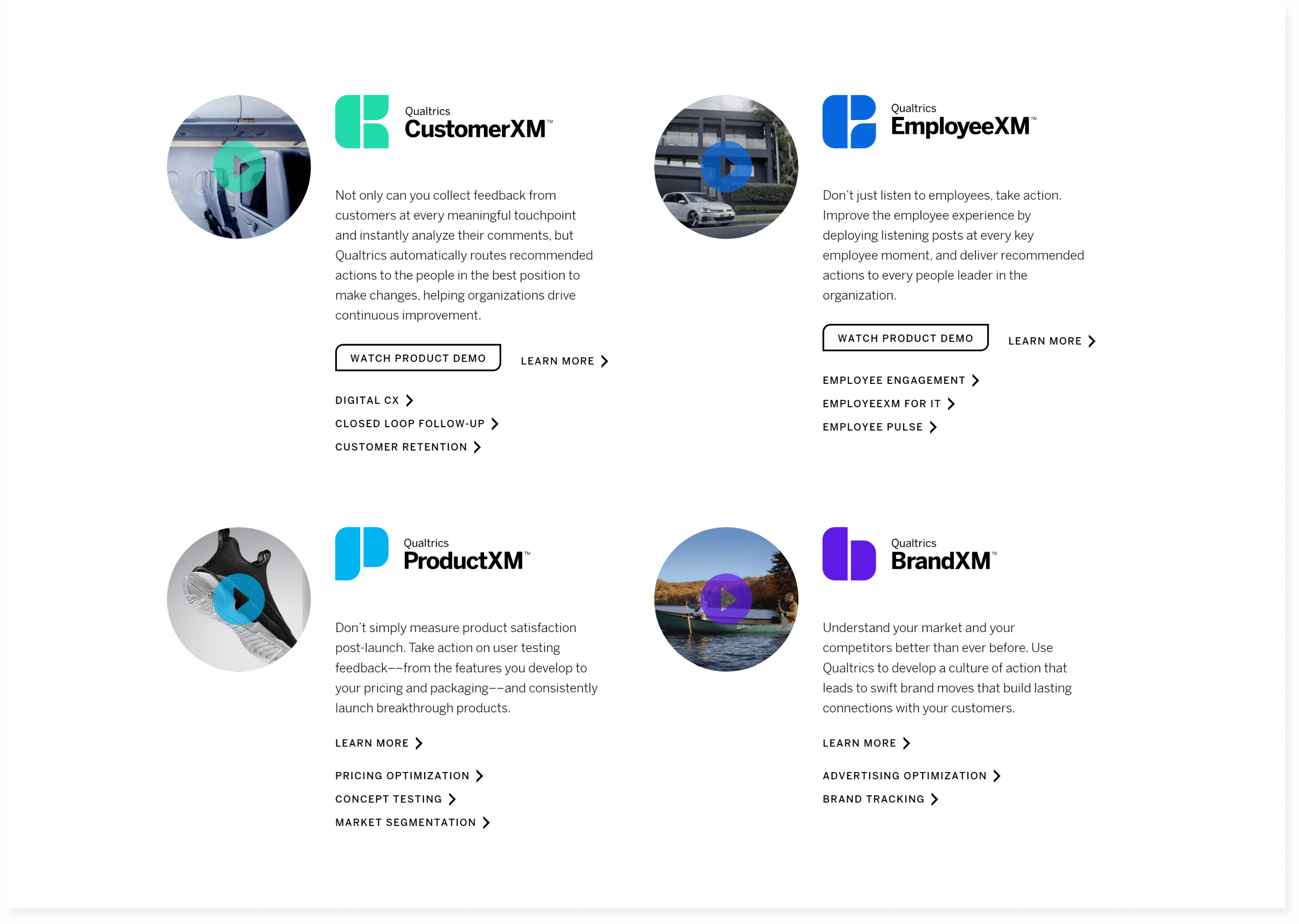
Qualtrics excelled at compartmentalizing software features clearly, which demonstrates care and elicits user trust. While not fully intrigued by it’s overall composition, we drew inspiration from this approach to highlight key platform functionalities effectively
Added a streamlined the three main steps section with imagery illustrating corresponding steps.
Simplified and condensed copy to focus on the platform’s core values and solutions.
Reorganized how content flowed to ensure key information appeared closer to what was above the fold.
Integrated high-quality screenshots and matching imagery to make the platform’s features more tangible.